Another note on book design. Poor design doesn’t ruin a book of poetry, but if you’re feeling hesitant or reluctant, then it doesn’t help. The spacing of words on the page, the feel of the book in the hand, even the way the spine falls open; it all matters. There’s no shortage of other books to read.
I have three volumes by Jorie Graham: Never (2002 Carcanet), Place (2012 Carcanet) and Fast (ecco 2018). Graham writes with a long line, usually in a long poem. Each of her poems is an undertaking: you know you’ll be there for the duration, in the great American tradition of Whitman, Ginsberg, John Ashbery, James Merrill or Adrienne Rich. The long line poses a particular difficulty – how to fit it onto the page.
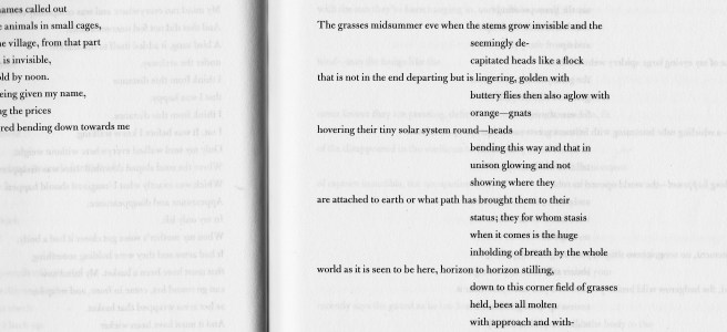
‘Never’ is in standard Carcanet width; the poems look a little compressed, as if they need to stretch out and can’t. ’Fast’ is the widest of the three books, plenty of room. But in many of the poems the vertical space between lines has been squashed, with lots of internal dashes and arrows. I know it’s a deliberate effect; for me it creates a visual thicket which is hard to enter. ’Place’ works best: throughout the book there is an alternation of long lines and groups of short lines (see the photo above). The spacing between lines and within the page is a model of clarity: I’m drawn in.
In case I might seem over-particular, the placing on the page matters very much to Jorie Graham herself. She wrote to the London Review of Books (Graham is an LRB favourite) about the challenge of her long lines:
“Tell your layout people they can move those inner margins (in this case way to the right) a tiny way back in towards the left – if that helps. Obviously the effect of the form has to stay the same but there is wiggle room, and I am open to all kinds of experiments’
from ’London Review of Books: an incomplete history’
